Google has rolled out certain changes to how it displays results on its search page – delicate but noticeable change.
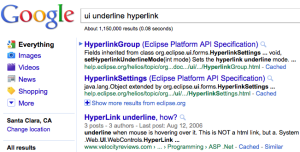
When talking about the two big changes – first is the removal of lines from the search results and second is the introduction of a yellow label. This yellow label is called “Ad/Ads”, these modifications are to redesign the search pages and making them cleaner.
Have a look:
Design lead for Google – Jon Wiley wrote on Google+ on Wednesday that, “We’ve expanded the size of search result titles and removed the underlines as well as evened out the height of lines. The move aims at improving readability and creating a look that is clean. We’ve also introduced our latest ad labels from mobile, to make multi-device experience more exciting.”
Web users started noticing the changes in the last two days, but officially confirmed by Jon Wiley on Thursday via Google+. The lines you are used to were adopted in the 1990s, being a part of web designing ideology. But in the last few years many sites have moved away from underlining links, to make their pages look cleaner.
Along with these changes, Google has also removed that light pink background you must have noticed at the top of the search page. The search giant has increased the font size for titles and it clearly means less character appears. The new layout will feature a dark gray color, rather than black.
Some users welcome the modifications but some didn’t. According to some users – the changes will definitely improve readability while others say it’s too blurry. They say that the font size is too bigger and the search giant also failed to use the full width of the screen.
The changes also looked different on different browsers and seem to be effective on Chrome as compared to Firefox.
Hope, the changes will not make it difficult for web users to use Google….


