innerBanner

3 Big Reasons Why Mobile Friendly Websites are the Future

Jazz up your business with a mobile-friendly website!

If you aren’t optimized for mobile, you’re losing potential customers… this is what you must be reading on different websites. But have to ever wondered why it is written almost everywhere these days? Why everyone is emphasizing on creating mobile friendly sites? What are the reasons behind such a big change? In this blog, we’ll discuss those big reasons that have made mobile friendly site a must have.

Even Google has recommended to build smartphone-optimized websites through its blog and also discussed about the three different configurations. It;s probably no surprise that the usage of smartphones and Internet has been dramatically increasing over the last few years. And a vast majority of sites are still not responsive, this is why Google came up with some recommendations and why it is necessary of businesses.

Let’s discuss it in detail and following are 3 big reasons why responsive websites are the future:-

1. Mobile Web Browsing is Exploding – A Google report says, “From smartphones and tablets to laptops and TV, 90% of all media interactions today are screen-based. People are learning to achieve their goals using all devices together”. This simply indicates that understanding that mobile browsing is increasing day by day has become an imperative for businesses. Today, people are spending more of their time on mobile devices and always have it withing their arm’s reach. Businesses should take it very seriously that desktops are going to become a thing of past.

Mobile friendly website

2. More Preference to Mobile Optimized Websites – People can visit websites either via the web browsers or their mobile devices, but most users prefer their smart devices these days. Most websites are not optimized for mobile phones and this simply means losing potential customers. As per a research conducted by Google, “Nearly ¾ of mobile users say they’re more likely to revisit mobile-friendly sites.” It means not having a responsive website means losing a big deal of sales.

Mobile responsive site

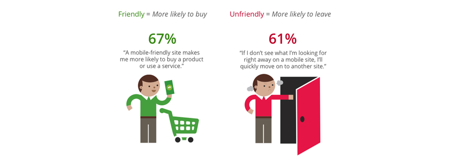
3. Mobile-friendly Sites Turn Visitors into Customers – If you don’t have a responsive website, you may be losing business. A recent study from Google showed that around 67% of users are more likely to buy from a responsive site and 61% users said that they get frustrated by sites that aren’t mobile-friendly. It simply means that without a mobile optimized website you are just driving your potential customers to your competition. As per the data published by Google, about 75% of users prefer a responsive site.

Mobile Friendly site

I guess, the above three reasons and the research conducted by Google should be enough to understand that how important are mobile-friendly websites.

The complete details on recommendations for a mobile friendly website can be obtained here. You can also conduct Mobile-Friendly Test to know which sites are responsive and vice versa…

Image Source: http://www.netpyx.net/

How to Make a Mobile Friendly Website and Attract More Visitors

Build a responsive website and turn your visitors into customers!

Today, people are using their smart devices to find a variety of products and services. Can those people easily access your offerings using their mobile phones and tablets? Think about it…

Having a website is not enough these days, you need to put more efforts to attract more visitors. You should build a website that works well on desktop, tablet and mobile, so that it not only look great, but follow all recommendations by Google that will make it a SEO friendly hub.

According to Google, a mobile-friendly website can offer the users a full mobile experience and make it a big hit among them. In this blog, we will discuss about some tips on how you can convert your traditional website into a mobile-friendly platform. And, here we go:-

  • Recreate a Mobile-friendly Version – This is a simple way to turn your site into a mobile site which ensures that everything on your site load correctly on mobile devices. A variety of tools can help you do the needful and the choice totally depends on what you and your clients want.
  • Make it Responsive – Instead of going for a completely new website, you could choose to convert your traditional one into responsive site. This could be an excellent option for businesses with limited budget and resources. Most companies prefer converting their existing site into a responsive one as they consider it the best investment. Shrink your current website using tools and make an effective mobile-friendly platform for visitors.
  • Share Information Visually – This could be the best way to provide information to the visitors since the screen size of mobile phones is much smaller than the desktops. Do not stuff unnecessary content and emphasize more on including info-graphics and videos as they are supposed to attract more visitors. Make your site practical for a digital ecosystem. Rearrange content into one column or you can hide content on load.
  • Consider Apps, Social Media and Email Marketing – It is a great idea to offer further support to your customers so that they can interact with you freely via social channels. Give a careful consideration to mobile apps depending on the factors like who are your customers and what they want from you. Offer them a quick service in the form of an app so that they can make orders, bookings and reservations on the go.
  • Consider Universal Mobile Design – Mobile phone screens are small and that’s why including mobile navigation options in like a must have. Find out the universal sizes people usually use and you can obtain data easily through Google Analytics. Design your site for a touch as fingers can’t right click or hover. Give enough space for a finger and use buttons to clearly define the link. Drop menus should be designed to provide accurate information.
  • Remember that the mindset of the desktop visitor and a mobile visitor is likely to be different, so design your website accordingly. Evaluate everything properly and look at the latest trends and mobile stats. As discussed on Google’s blog, a mobile-friendly site make visitors more likely to buy a product or service.

    Is your website mobile-friendly? Test it right here

    Image credit goes to:

    https://lh4.googleusercontent.com/DQPupAidKLGgiuupAK9uwyqWT7hi-glNbcGCoD3p8Xejvn4CKyBB68gcnvHJ–CYjVyxSg4KfqoKcErJEFnkJt0NWK1jSOz3jfsm306TCt1RtFQKM7Tb